The Kelty Foundation
Tagline, Brand Personality, Brand Story, Web Copy, Marketing Materials
Brand Mood
Impact | Emotion | Hope
Branding in collaboration with NatPark Creative
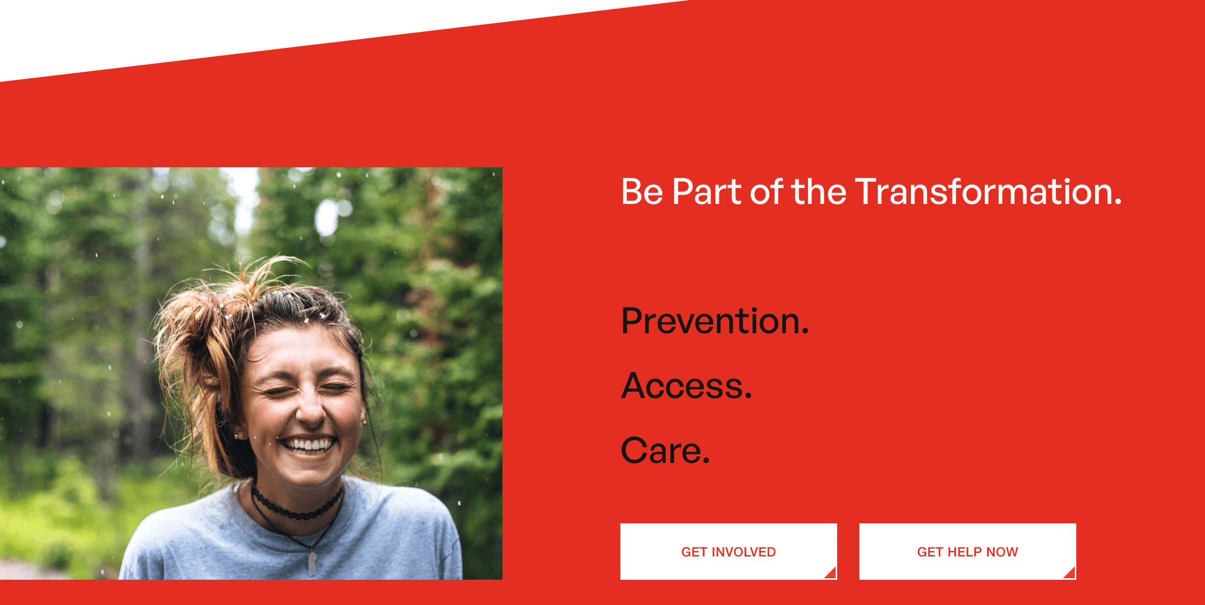
This rebrand aimed to redefine the Kelty Foundation to better resonate with today's parents, addressing their current concerns and challenges while infusing a fresh perspective and more energetic tone.
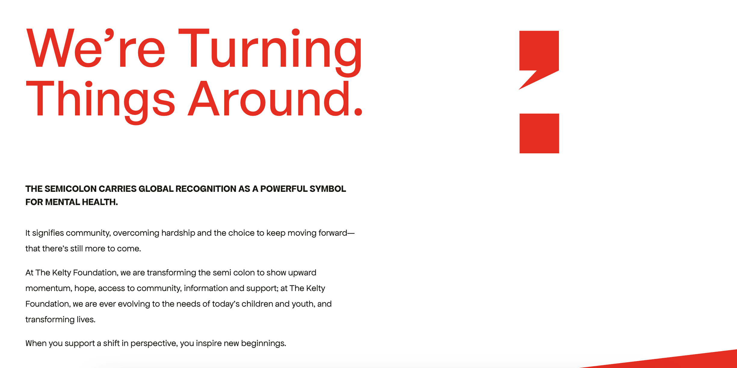
The semicolon carries global recognition as a powerful symbol for mental health, signifying the choice to keep moving forward—that there’s still more to come. For this rebrand, we transformed the semi colon into a bold, modern statement that represents upward momentum and hope.
Full website available here: https://www.thekeltyfoundation.org
